The debate about genetically modified crops is sometimes difficult to follow. Some claim they did not deliver on their promises. Others claim that yields are higher thanks to GMOs. Obviously, the answer is not obvious.
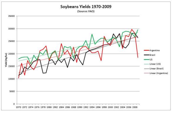
When in doubt, it is good to go to the basics and see what the stats show us. I have collected the yield data from the FAO over the period 1970 to 2009 and compiled them in graphs. For soybeans, I show yields for the US, Brazil and Argentina, as they are the main producers.
For corn, I show the same three countries, plus France and the Netherlands. The Netherlands are interesting because they have much higher yields than other countries (30% higher than the US and France). However, they are not a large producer, but Dutch farmers are quite highly technically skilled farmers. France is interesting because it is a major agricultural producer, and also a strong opponent to GMOs.
I also added trend lines to show any divergence between the countries. The Netherlands are shooting up on corn. France is slowly catching up on the US, while yields in these two countries have been very close all along. For soybeans, Brazil shows a stronger uptrend than the US and Argentina, while it seems to lag the others for corn.
What these graphs also show is how much potential there is. If the Netherlands can produce 13 tons/ha (without GMO technology, mind you), this means that the genetic potential is higher than that number.
Here are the graphs (click on them to have the larger version). Can you spot when GMOs were introduced?
The annual yield variations for corn and soybeans for the countries mentioned are as follows:
| Average yield variation per year (ton/ha) | Average yield variation per year (%) | |||
| 1970-’95 | 1996-’09 | 1970-’95 | 1996-’09 | |
| Corn | ||||
| Argentina | 0.90 | 1.41 | 3.9% | 3.5% |
| Brazil | 0.46 | 0.96 | 3.2% | 3.6% |
| USA | 0.83 | 1.41 | 1.8% | 1.8% |
| France | 1.21 | 0.61 | 2.4% | 0.7% |
| Netherlands | 1.57 | 3.43 | 3.8% | 4.3% |
| Soybeans | ||||
| Argentina | 0.34 | 0.31 | 3.3% | 1.5% |
| Brazil | 0.37 | 0.38 | 3.2% | 1.7% |
| USA | 0.25 | 0.19 | 1.4% | 0.7% |
Keep in mind that yields vary depending on production conditions, and that the numbers for the years 1970, 1995, 1996 and 2009 can influence the annual yield variations to some extent. I took the averages of the three years at the beginning and the three years at the end of both periods to eliminate the incidental “abnormal” data. It gives an idea of the comparative performance between the two periods.
These are just stats. I will leave to everyone what conclusions they may want to draw from the numbers and the charts.
Copyright 2011 – The Happy Future Group Ltd.


